
2019 Web Design Trends
Speed and simplicity
Designing for mobile is a must. Mobile users spend twice as much time on the Internet as desktop users. They aren’t just purchasing from their phone. They’re out in the world, on 3G networks, researching products and looking for deals. In July of 2018, Google rolled out its Speed Update to give faster mobile sites better SEO rankings.
Websites that load quickly and communicate swiftly are satisfying. They have lower bounce rates, a higher number of page views, and higher rates of conversions than their slower counterparts. Speed has a direct effect on a business’ bottom line, so simplicity will be more important than ever.
Simplicity is achieved by removing elements a site doesn’t need. As the world gets more crowded with information, simplicity stands out. Simple sites are often smaller, faster-loading, and offer a streamlined user experience. By delivering what the user needs and nothing more, a simple site can instill confidence, drive conversions, and look good.
Simplicity comes in many forms. Minimalism, flat design, pageless design, and brutalism are some of the ways simplicity will speed up sites in 2019.
Minimalism
Simplicity and minimalism are two related, but distinct, concepts. Minimal websites are always simple, but simple websites are not always minimalistic. Simplicity focuses on reducing complexity while minimalism reduces quantity.
Minimalist websites emphasize a few elements and nothing more. They’re driven by a single purpose. The number of colors, fonts, and sizes are reduced to magnify the most important design element. They use contrast and white space to amplify what’s left on the page. These principles create polished, focused sites that help users get what they need. They’re data-light, so they load fast and are easy to navigate. Because there isn’t much on the site, what’s there is impeccable.

Designed by Circle member Ivan Iannoli, this website uses white space and a minimalist design to draw attention to John Priola’s photography.
Flat design
Flat design is here to stay. It’s a fast-loading, low-data style that’s great for mobile and desktop users. It’s evolved from the strictly two-dimensional aesthetic that it once was.
Like simplicity and minimalism, flat design de-clutters the user’s experience. It simplifies the user interface with shapes, blocks, typography, and two-dimensional illustration. It doesn’t rely on complicated animations, embellishments, or textures. Open space, clean edges, and contrast create the effect.
In recent years, flat design has been evolving. While it’s still relentless in its focus on simplicity, it offers users more enticing visual cues with bolder color palettes, gradients, and even depth. When flat design is done well, it isn’t exactly flat. It’s focused on doing more with color, edges, and space. Shadows and depth help users navigate the experience.
One-page design
One-page designs (sometimes called single page or pageless design) streamlines an entire site onto a single page. Instead of funneling users from different pages to the CTA, every element is part of the website’s narrative. They can be immersive, coherent experiences.
Pageless sites tend to be fast. They’re responsive and smaller than traditional sites, so they load quickly. Instead of clicking through the site, the user just needs to scroll, usually vertically although horizontal scrolling has gained traction. Since designers have more of a say in how the content is consumed, pageless sites can have more of a story. The speed of performance and focused experience can lead to higher conversions.
Great pageless sites tell a story and have a singular purpose. When users land, they know exactly why they’re there and what they can expect. Since they know they’re in the right place, they’re less likely to bounce.

Designed by Circle member Siduri Poli, this website is a one-page design that leads users through the story of Changers World.
An Index Page can create a one-page design experience in Squarespace by taking content and images from other pages and stacking them into a single scroll.
Brutalism
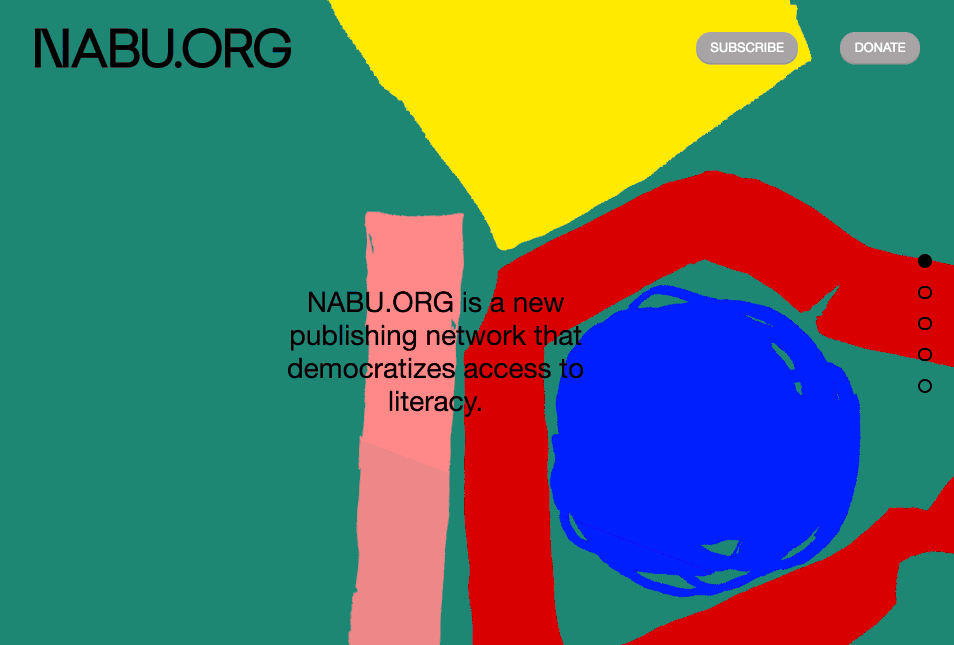
This collaboration between Circle member Napkin.Studio and Established NYC uses a broad spectrum of colors and diverse fonts to create a memorable experience for visitors to NABU.org.
In architecture, Brutalism is associated with raw concrete. In web design, it means an unwavering focus on content for a better user experience. Many people know it for its harsh aesthetic.
Brutalist sites move away from standards that have come to define web design and UX. They can be incongruous with their use of color, overlapping type, and inconsistent proportion. They aren’t smooth or seamless, but they’re deliberate, rough, and exposed. Some people might consider them ugly, but 2018 was a big year for Brutalism. In 2019, the style will mature.
Brutalism generally involves bold choices in color, type and layout. It isn’t for every audience, but it leaves an impression and always stands out. When it’s done right, it’s arresting and unforgettable.
Humanity
Speed is important, but it isn’t everything. As users spend more and more time on the Internet, signals of humanity become increasingly important. Life rarely maps to a grid.
There are a number of ways to give your next website a human touch. Vibrant colors, custom illustrations, natural shapes, and video backgrounds will do so in the coming year.
Natural shapes
Sharp edges and straight lines have their place, but 2019 will see more natural shapes as designers replace clean geometry with organic composition. Curves, flowing shapes, and broken grids may not offer as much structure as rectangles and octagons, but they do create space for interpretation.
Different shapes have different effects. Pointed visuals draw the eye while smoother configurations add to a site’s ambiance. Many of the web’s most organic shapes draw inspiration from nature.

Circle member Crea features natural shapes on their website which showcases their mold-breaking brand and creative outlook.
Vibrant colors
Without saying a word, color can inject a site with emotion. Over the past few years, websites have been getting more colorful. Millennial colors are overdone and are no longer memorable. Deeper colors, dreamy gradients, and warmer tones will become more prominent.
Vibrant sites use powerful colors to accentuate the site’s focus. They don’t overwhelm the user. They underscore the content on the page. Unless they’re going for a Brutalist effect, the colors harmonize. The colors are chosen carefully because a user can be anywhere—on the beach, under fluorescent lights, or in the comfort of their home.
Custom illustrations
Illustrations can convey concepts that are hard to capture at a photoshoot. They have personality and tell a story in ways that content can’t. While many sites follow similar design patterns, custom illustrations are inherently unique.
Good illustrations can command attention and set the mood for a site. They can be elegant, whimsical, surreal, and sophisticated. They get the point across by connecting all the dots in an engaging, memorable way. Some of the most effective brands leverage custom illustrations to stand out against competitors.
Animations
Animation is captivating. Like custom illustration, it conveys personality and tells a story. Browsers are more advanced than ever, and animation tools are increasingly accessible.
Animations improve the user’s experience. When used strategically, they turn a static interface into a living canvas. Expect to see more animated navigation, flexible headers, and highlighted microinteractions.

Built by Circle member 40/40 Creative, the Transit Australia Group site uses custom animations to represent the movement and dynamism of their brand.
Video backgrounds
A video background is impossible to ignore. It pulls users into the page, keeps them around for longer, and increases conversions. It requires more data than flat design or a custom illustration, but it’s a good tradeoff if it improves the user experience.
The best video backgrounds don’t compete with the rest of the site. If the content requires the user’s undivided attention, a video is distracting. Video is more engaging when it creates visual contrast with the rest of the site. It can help users get to know a product or brand in a matter of seconds.
Check out the guide to adding a background video in Squarespace.
Want more?
Check out Squarespace Circle, Squarespace’s program for professional designers. Along with exclusive content, discounts, and other perks, Circle brings professionals together from all across the globe to exchange advice while connecting with new clients and collaborators.