2021 Web Design Trends
Geometric and organic shapes
Geometric shapes are essential in web design but can create a boxed-in experience when overused. Expect to see dynamic abstractions and pairings of geometric and organic shapes in 2021. This may appear in several places, such as logos, cut-out images, and CTAs.
Consider the brand or client you’re working with when deciding on the right shapes for their site. For example, squares and rectangles can convey a sense of authority and structure, whereas rounded shapes and circles can communicate more dynamism, movement, and harmony.
THT Health uses circles, semi-circles, and other rounded shapes in their logo and throughout the site. Paired with rounded cut-out images, this motif brings life to a website that serves their lively community.
Organic grids
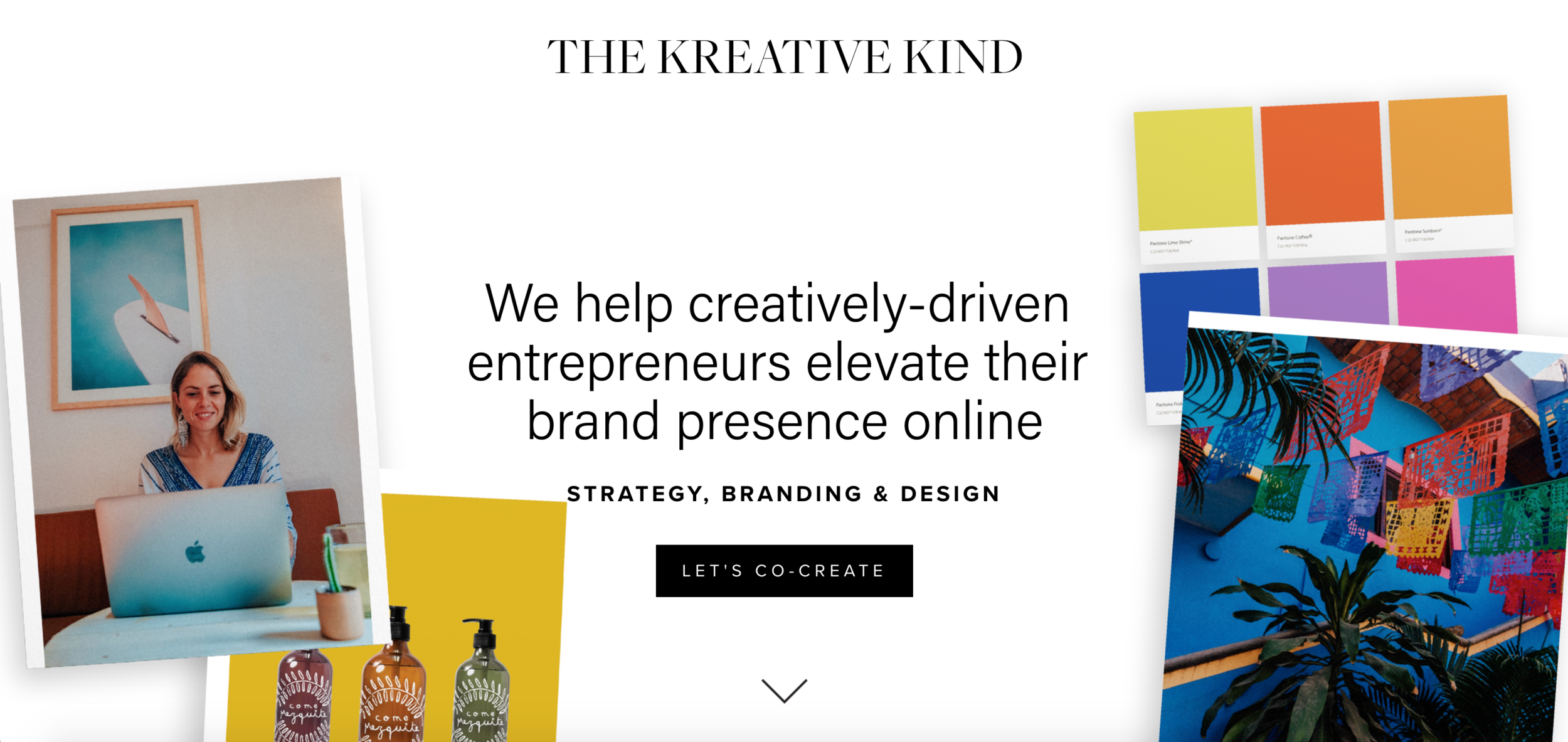
The grid has been a web design standard since the 90s, but 2021 will see more organic blending of elements on a page. Similar to geometric shapes, straight grids with sharp angles can be reminiscent of antiquated spreadsheet style websites. Instead, use organic grids to create structure without boxing in visitors. Consider asymmetrical grids, overlapping elements, and photo collages.
To break the grid of their portfolio, The Kreative Kind leveraged stacked photo collages to showcase past work in an eye catching way.
Custom illustrations
Photography will always play a vital role in web design, including stock photos which level the playing field between companies that can afford high production shoots, and smaller businesses that are held to tighter budgets. Squarespace is integrated with Unsplash and Getty Images, making it easy to find free and premium images for your sites.
Even so, custom imagery and original content will always do more to establish the emotional connection between a site and its visitors. When you’re planning a site, ask the client about illustrations. They may be open to procuring some for the project, depending on their brand and budget. Illustrations can sometimes be a more affordable option than custom photography since they don’t rely on sets, props, or models. You may be surprised at how often illustrations can work as effectively—or even more so—than photography.
Type chaos
Typography has always been a pillar of web design. Years ago, you might have heard some strict rules about the number of fonts, alignment of copy, and limits to text decoration (bold, underline, etc.) on a website but designers have pushed the boundaries on legacy best practices in recent years. While some of those tenets are still rooted in improving load time and overall UX, mold-breaking designers will find creative ways to express their clients’ brands through typography.
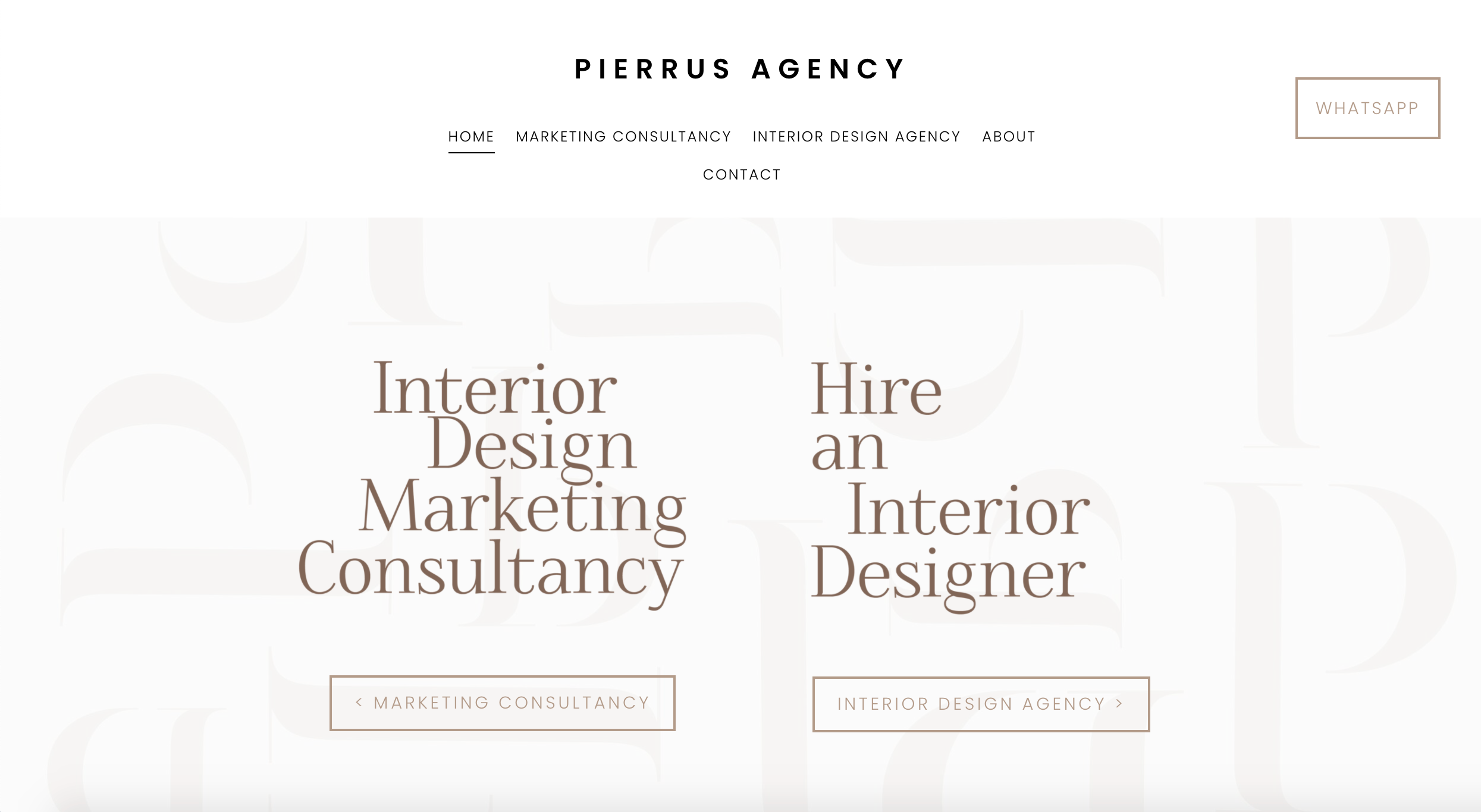
Expect elements like intentionally misaligned copy, abstracted or warped type, transparent letters, 3D typefaces, and strategically obstructed headings in 2021.
Pierrus Agency created headings with custom alignments that create a functional but appealing visual effect that leads the eye to their CTAs.
Mobile obsession
Search engines have shifted to preferring mobile-first sites over desktop-first competitors. Being optimized for smaller screens isn’t a nice-to-have; it’s a necessity.
On Squarespace, mobile optimization is a given. Squarespace sites are mobile-friendly, without any custom CSS. When you design on Squarespace, you don’t have to maintain different looks for different screens and different browsers. That said, there are still ways to optimize a site for mobile.
When you’re laying out a site, be obsessive about the mobile version. Consider that the content will stack vertically. Balance image resolution with file size. Higher resolution images look better on HD and Retina screens but you don’t want any one web page to be more than 5 MB. 1 MB is the safest size for cellular connections.
If you use images that contain text, keep in mind that they’ll be rescaled for mobile. Check that the text doesn’t become distorted or illegible. As always, check the way it looks on a laptop, desktop, and phone to be sure it can be viewed properly on each platform.
High functionality
It takes more than a great website to run a successful business. Providing tools that empower clients to build their strategies and take action can improve their experience. But clients usually don’t want to download or sign up for additional apps, software, or services.
One way to expand what your client’s toolkit is to give them simple solutions for the other parts of their business. Squarespace offers a suite of design, marketing, and analytics tools as well as extensions that can help you add value to your clients’ businesses:
Email Campaigns: Build and manage mailing lists, and create visually compelling emails and newsletters.
Commerce: Manage and sell products and services using our rich commerce tools.
Extensions: Expand the built-in functionality of your Squarespace site with curated extensions.
Member Sites: Gate and monetize members-only content.
Acuity Scheduling: Let customers seamlessly book appointments and classes.
Unfold: Create beautiful stories for social media.
In 2021, clients may come to you to help them leverage Squarespace to build human connections with their customers. To do so, you’ll want to be creative with grids, shapes, and typography, and ensure the sites you deliver are mobile first and highly functional.
Want more?
Check out Squarespace Circle, Squarespace’s program for professional designers. Along with exclusive content, discounts, and other perks, Circle brings professionals together from all across the globe to exchange advice while connecting with new clients and collaborators.


